
Abstract: This essay is to analyze the brand and experiential graphic design of The Pumpkin Patch which is located in downtown of Ames, Iowa. The main proposition is that how the brand and visual design deliver the meaning from space to customers to impact their experiences. This view of analyzing the brand experience started with reading Visual Culture by Richard Howells, Joaquin Negreiros [2012] and decoding diversities of visual artworks in the class discussion. This study has a chance to prove visual languages and connotation along with iconology and history by in-store observations and staff interview.
Keywords: Brand; Experiential graphic design; visual language;
INTRODUCTION
The Pumpkin Patch is a small shop selling books, toys, gifts and clothing for children, which was originally opened by Emily Munson selling children’s clothing at The Livery in Bonne, Iowa, 1978. After 7 years successful running the business, Emily Munson combined the adjacent companion shop, A Different Drummer, under The Pumpkin Patch name and relocated to the old Eschbach Building on Main Street, Ames, in the fall of 1985. With more spaces, a full collection of children’s books, toys, and furniture based on owner’s habit was added to the shop.
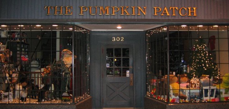
As whoever approach to the front door of The Pumpkin Patch at Main Street, Ames, you are able to see an all capital nouns title in serif and very Europe style, which is placed close to the edge. From the perspective of semiotics in the Visual Culture by Richard Howells, Joaquin Negreiros [2012]: “To figure out the meaning of a visual text is not simply about what a visual text means but how it means.” The term of using all-caps title brand could be a symbolic signal. In the base of some historical researchers, The term of using capitalization can be for headlines and book or chapter title at the top of a book page; however, the term of using all-caps nouns in the High German family are the only major languages using the Latin alphabet in which all nouns are generally capitalized. In that case, This visual text generates some sense of connotation about shop owner’s taste that could be specific on Europe culture.
ENTRANCE
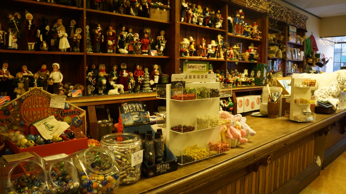
The experiences could be conceptualized as “A Journey in The Wonderland” was full of surprises. An indicate can be seen that is indeed a collective toy house by the long row of the cabinet with the number of character models and dolls at the entrance. According to Susan’s words, the cabinet, front desk, and The Nutcrackers are originally from Germany, the dolls are from different places in the United States, and other things come from China but just a small part of Emily Munson’s collections during her 39 years running the business.
MYTHOLOGY
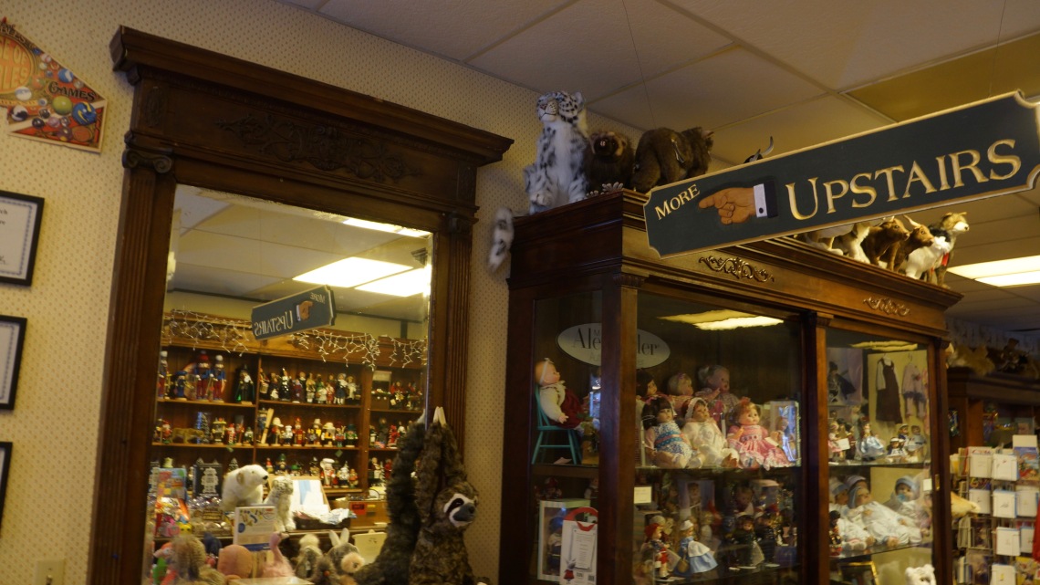
It’s pretty mysterious perception standing by here with a sign points into mirror and guide my way upstairs through a mirror. The symbolism associated with the mirror has its root in very distant past. Some of the oldest drawings found on temple walls
and papyrus scrolls depict images of Egyptian Neters gazing into hand-held mirrors. In ancient times, Mirrors were made of polished bronze. Today, mirrors are made of glass. However, the mirror can be any reflective that to reflect the life each person creates, including people, places, and events in the viewer’s life. It’s also a symbol of spiritual thoughts and actions. Although the actual stairs are right behind the mirror, It can’t help me with thinking of a magical door shows in the mirror some times.
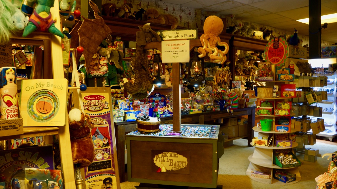
The communication atmosphere in the shop also carries some sort of mythology in the dark side of collection. According to Liam Otten’s wring The Collection on Display that “A collection is not a static thing, it’s a project to be finished.” The collection provides some certain passions can be addictive just like drug or gambling. Like some of the toys, they are placed in the top of the cabinet, which people is not easy to notice and reach.
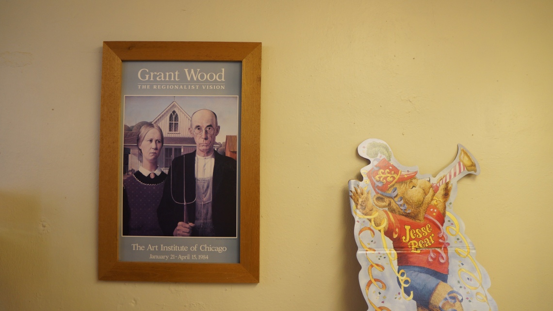
Furthermore, you can see a Grant Wood’s painting that is placed right beside a teddy bear card in the second floor. It’s there just because it’s another collection of the owner without any function and connection with the shop.
CONCLUSION
The Pumpkin Patch is an interesting brand experience as we learnt from Visual Culture by Richard Howells, Joaquin Negreiros [2012] convey a lot of meanings to evoke experiencer and creator’s personal emotions in space. Thinking of how the visual text, objects and signs communicate with experiencers is beneficial for designers to better define the meanings of design.
